
NPACK
The NPACK logo design process began with a meeting to define Nijel Pack’s identity in college basketball. From there, different logo concepts were created, improved, and finalized. The finished logo was provided in various formats for both digital and print use. Along with the logo, shirt designs and social media graphics were made to boost his brand visibility across different platforms.
Work done at Mojo Up Marketing + Media
-
The collateral included a variety of design elements, such as shirt designs and social media graphics, all designed to support and amplify the refreshed brand identity.
-
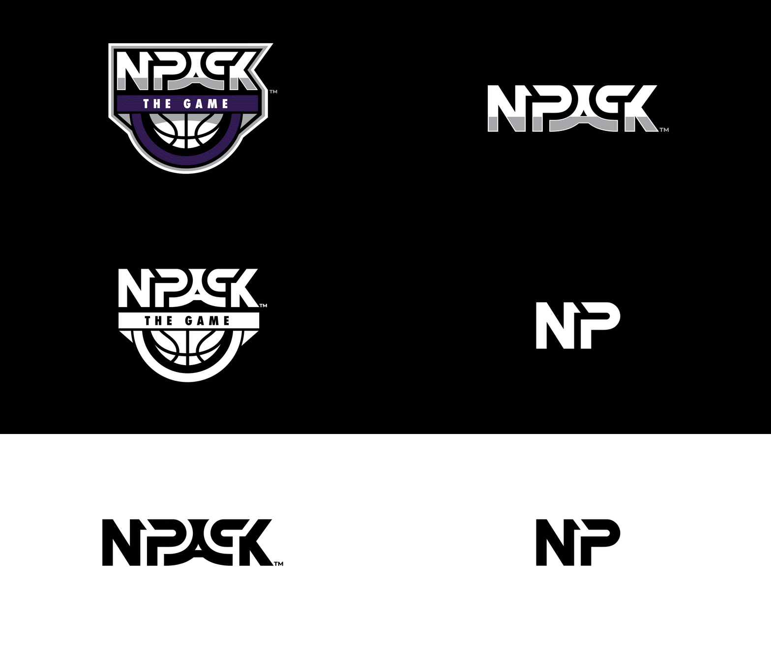
Refined and evolved the existing logo to better reflect the brand’s identity and enhance functionality while preserving its core message – to NPACK the game of basketball. This included updating the typography, adjusting the color palette, simplifying elements for scalability, and modernizing the overall design.
CREATED WITH INTENT
Developed with an emphasis on research, creative strategy, communication, and efficient project management.
LOGO REBRAND


The SOLUTION:
The solution involved a comprehensive rebrand, refining Nijel Pack’s existing logo into a more versatile and adaptable design. By enhancing its scalability and readability, the new logo seamlessly integrates across various collateral, from digital platforms to apparel and print materials. This redesign ensures a cohesive brand identity while maintaining the essence of the original logo.
My Role: Designed NPACK identity and designed collateral with the logos
UNDERSTANDING The problem:
To address the challenges of limited logo versatility across various types of collateral, undertaking a complete rebrand for Nijel Pack was necessary. This initiative focused on creating a fully redesigned logo based on the previous logo.
My Role: Led the creative direction for the logo redesign